This project was an immense undertaking in many realms including scale, animation mechanics, mechanical intricacies, and shape language. Created as a part of my NOMADS personal IP world, “Dancers” act as mobile lunar patrol robots capable of both traveling at high speeds as well as controlled freefalling and being able to attack from above. Themes taken into account from the very beginning of the project were bugs, dance, robotics, military hardware, and modern space tech.

Teaser promotional shot.

An animated turntable featuring the design of the internally housed weapon system and processor.


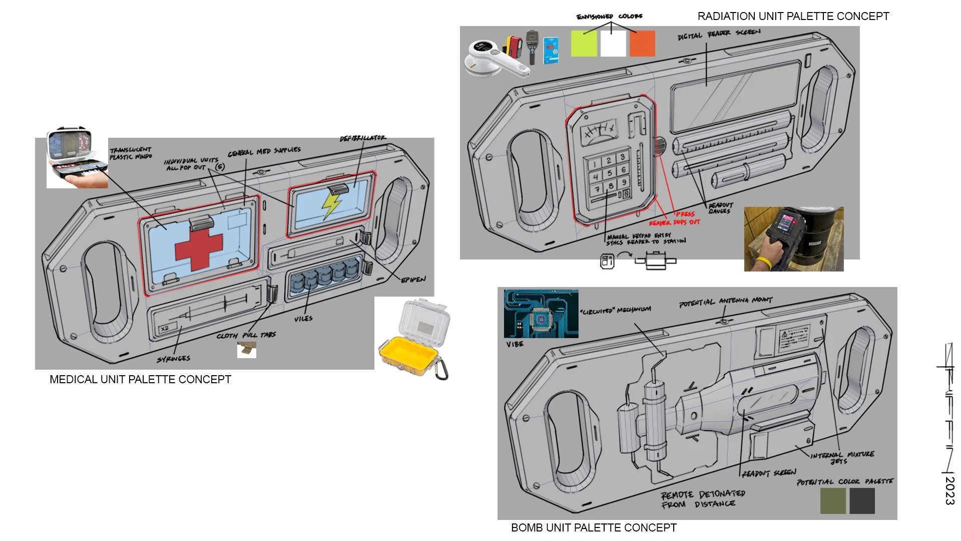
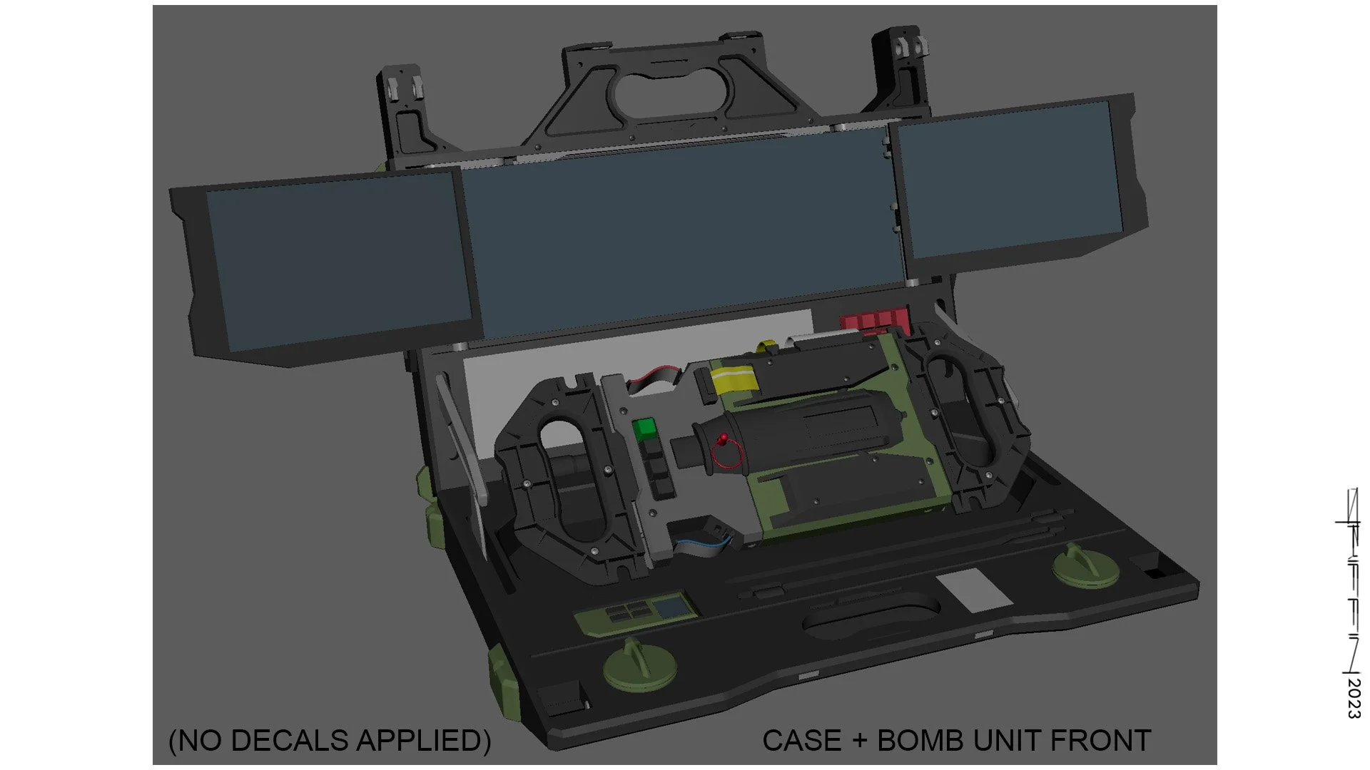
Callout sheet 1 explains the parts system of the body unit.

Callout sheet 2 delves deeper into the body unit and strips it of it’s smart armor. Revealing the arms and motors.

Callout sheet 3 explains the logic behind “fragmentation wheels” and how they make for a more robust and durable enemy. Additionally, the dual thruster systems are shown in more detail.

“Inbound” is a piece depicting two dancer mates deployed to a specific undisclosed location, being tracked via MOTHER satellite system.

“Above!”

Refined design sketch 1

Refined design sketch 2

Refined explorations 3

An earlier design that actually had a lot of promise but was ultimately altered for feeling too much like a “batbike” and being smaller in the scale department than was the goal.


Early exploration 3. “Gemini Bike”. I actually really liked these early explorations a lot, they were uncommital, fast and loose, and just fun. the idea behind this one is it has the ability to split in half and uses a hardened, near indestructible cable to cut it’s enemies in half at high speeds. Anything I design always has to work as a potential toy I would want as a kid (or even now :P) and these early sketches did just that.

More explorations. I really loved the idea of a “hidden gun” (more toy dreaming..) and was pretty sold on the design to the right, having a sort of mouth and surprise element to it. While we got even weirder and more imaginative with the final design the seed of a hidden weapon had been firmly planted and ultimately made it tot he final product, albeit in a way I couldn’t have imagined this early on.

Initial sketches :)

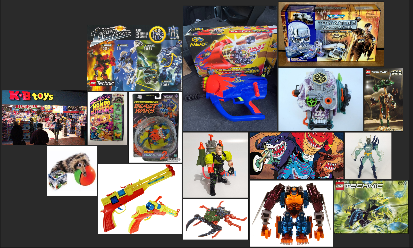
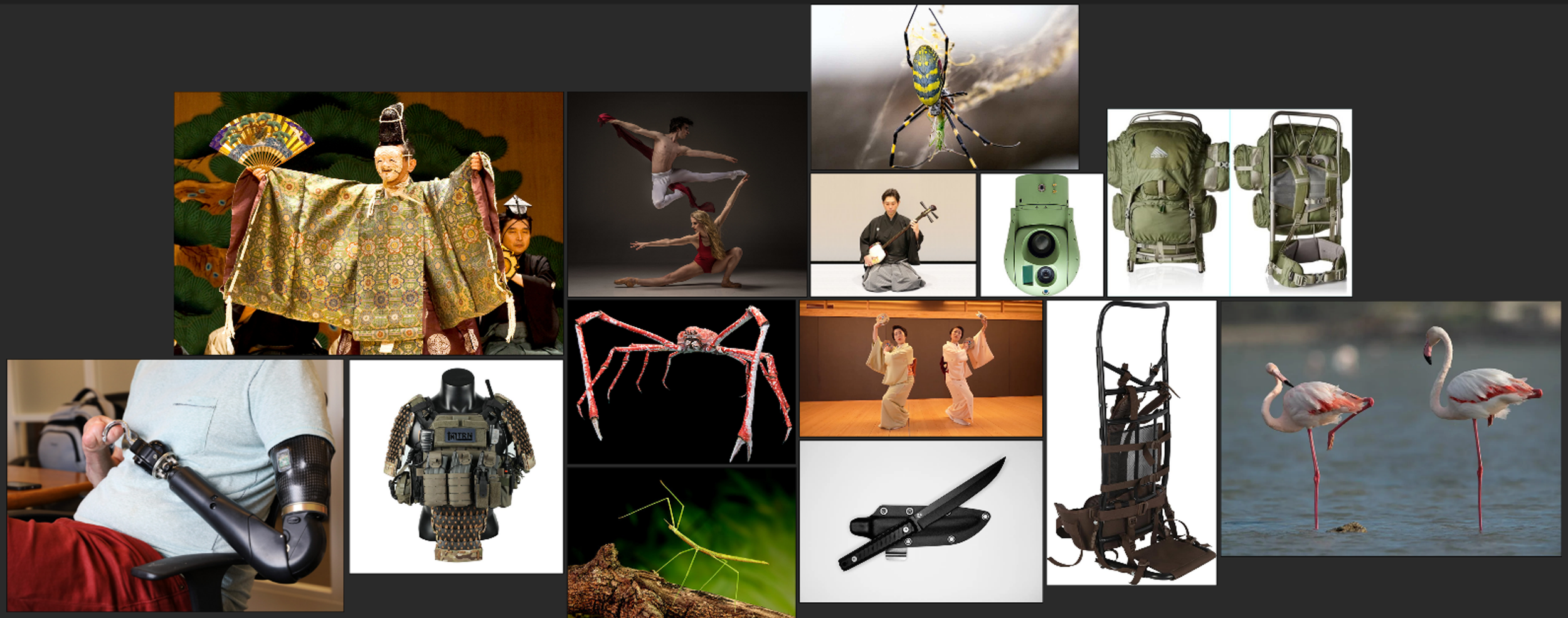
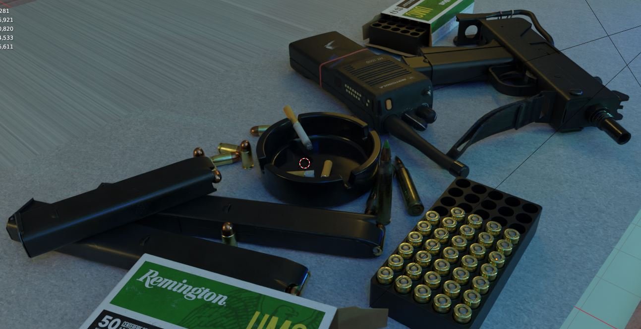
Reference.